
Colour advice
Interior Paint Colours That Work in Calgary Light
· 5 min read
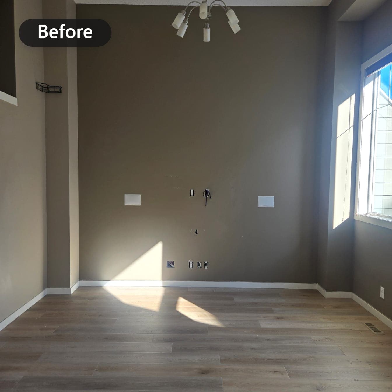
The paint chip looked perfect in the store, then it went up on your wall and turned grey, or green, or strangely cold. That is not your imagination. It is Calgary light. Our northern daylight changes how every colour reads, and choosing paint colours that work here starts with understanding what that light is doing.
What northern light does to paint colour
Calgary sits at about 51 degrees north, roughly the same latitude as London. For much of the year, sunlight reaches us at a low angle, and in winter the sun barely climbs above the rooflines before it starts back down. Low angle light is softer, weaker, and cooler than high summer sun.
Northern daylight also carries a noticeable blue cast. That cool light pushes colours toward their cool side: greys look bluer, some whites turn icy, and beiges can go flat and muddy. Add our short winter days, when you mostly see your walls under lamps and pot lights, and one colour can behave like three different paints over a single year.
None of this makes Calgary a bad place for colour. It just means the shortcut of copying a colour from a magazine, a showroom, or a friend's home in another city often disappoints. The room, the light, and the season all get a vote.
Warm and cool undertones, and why whites shift
Every paint colour carries an undertone, a quiet second colour hiding underneath the obvious one. A white can lean yellow, pink, green, or blue. Strong warm light hides many of those undertones. Calgary's cool light does the opposite: it finds them and turns the volume up.
This is why the search for the best white paint for northern light frustrates so many homeowners. A stark, cool white that looks crisp in an online photo can feel like the inside of a freezer in a Calgary living room in January. Whites with a soft warm undertone, the ones usually labelled off-white or cream, hold their warmth through the winter months.
The same logic applies to greys and greiges. A grey with a blue undertone reads even bluer here, so if you want a grey that feels calm instead of cold, start with versions built on a warm or slightly green base, then confirm it in the actual room.
In Calgary, light is the other half of every paint colour, so choose for the room you have, not the room in the photo.
North facing rooms versus south facing rooms
The direction a room faces matters as much as the colour on the chip. North facing rooms receive steady, indirect, cool light all day, which exaggerates blue undertones. They almost always reward warm choices: creams, warm whites, and earthy neutrals that push back against the chill.
South facing rooms get the warmest, most generous light in the house, and they forgive almost anything. Cool blues and greens that would die in a north room can look wonderful there. East rooms are warm in the morning and cool by afternoon, and west rooms do the reverse, ending the day in a warm glow.
Do not forget the light you buy, either. Bulbs marked 2700K cast a warm, yellowish light that flatters warm colours in the evening, while bulbs at 4000K and up lean cool and can make the same wall look different after dark. Whatever colour you pick will spend Calgary's long winter evenings under those bulbs, so they are part of the decision.
How to test paint colours properly
A paper chip the size of a business card cannot tell you how a colour behaves across a twelve foot wall. Testing properly costs a few dollars and a weekend, and it protects you from the most expensive mistake in painting: doing the whole job twice.
- Paint sample patches at least two feet square. Big swatches tell the truth; small chips flatter every colour.
- Put the same colour on two different walls, one near a window and one in shadow.
- Check it in the morning, in the afternoon, and at night with your usual lights on.
- Hold it against the finishes that are staying: floors, countertops, tile, and trim.
- Live with the swatches for two or three days before you decide anything.
Build whole home flow with a small palette
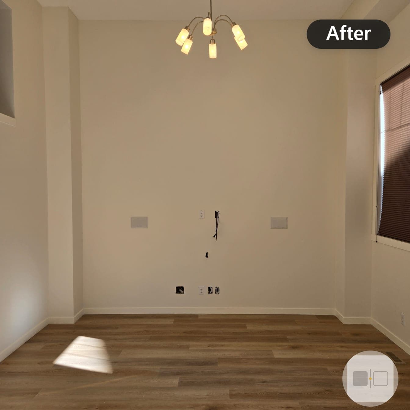
You do not need a new colour for every room. Most homes feel calmer and larger with a limited palette: one main colour for connected spaces like halls and living areas, one trim white used everywhere, and one or two accents for rooms that can carry them, like a den or a powder room.
The trick is keeping undertones in the same family. A warm main neutral, a warm white on trim and ceilings, and a deeper accent built on the same base will flow naturally as you move from the bright south side of the house to the cooler north side. Mixing warm and cool undertones side by side is what makes a home feel slightly off, even when nobody can say exactly why.
When a colour consultation earns its keep
If you have read this far and still feel unsure, that is normal. Undertones are genuinely hard to see without practice, and the stakes are real: guessing wrong on a whole main floor means paying to paint it again.
That is why Flying Post Painting includes a complimentary colour consultation with every job. You compare real samples in your own light, against your own floors, with someone who has watched these colours behave in Calgary homes through every season. Estimates are free and every quote is written and itemized, so you know exactly what you are agreeing to before a brush touches a wall.
Start with the room that bothers you most. Call or text (403) 926-7202 and tell us what you are working with, whether that is a single north facing bedroom or a whole main floor.
Flying Post Painting is a residential painting company based in Calgary, Alberta. Proudly Indigenous owned. Call or text (403) 926-7202 for a free estimate.